The Lawn Barbers · 2023
The Lawn Barbers
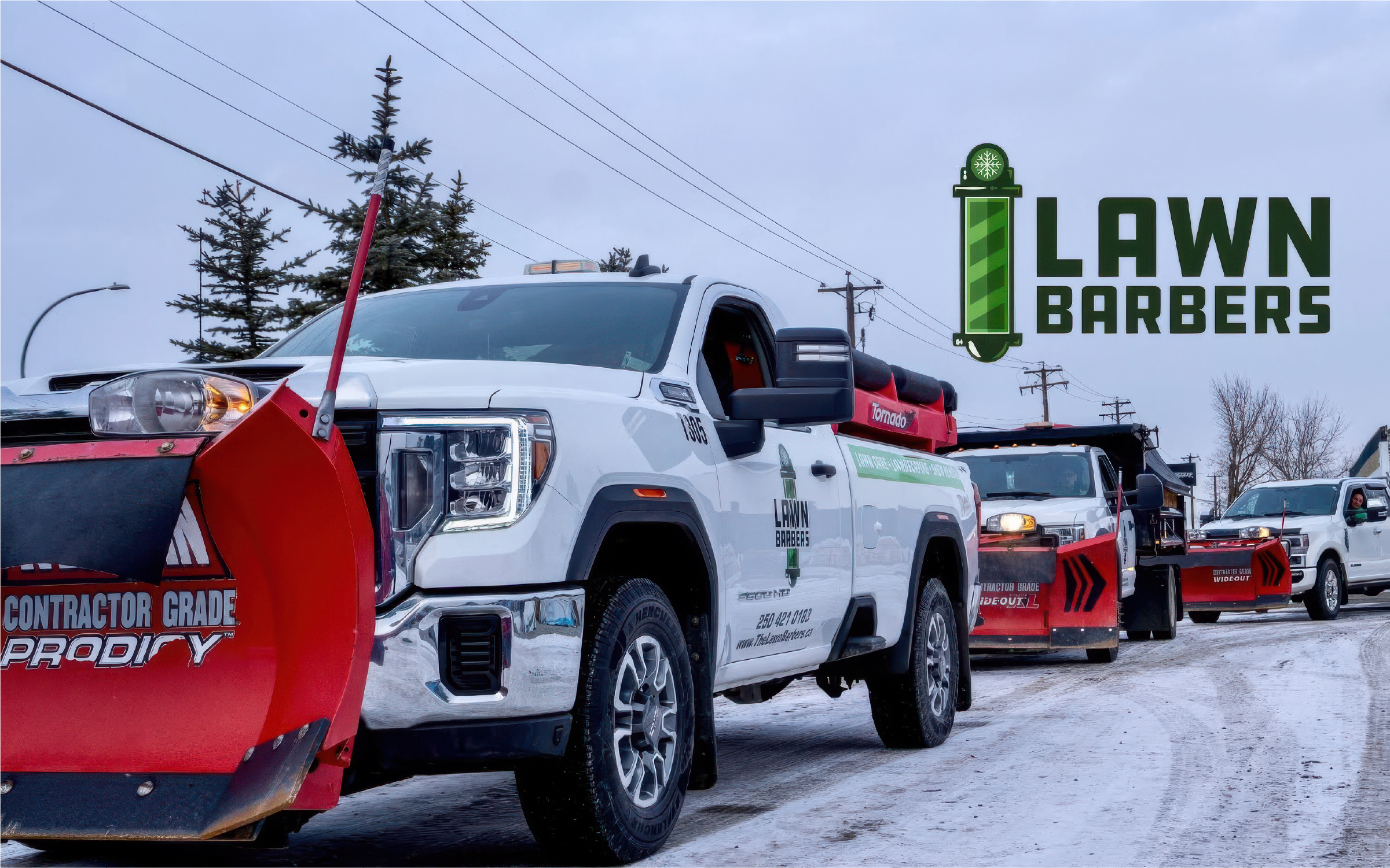
A full rebrand for a trades business, from logo system to website, fleet and uniforms.
The brief
The Lawn Barbers is a local lawn care, landscaping and snow removal company. Their original logo had a great idea at its core, the barber pole, but it was buried. Arched type, a chrome pole, a mower silhouette, a gradient oval and a second line of curved text were all fighting for attention.
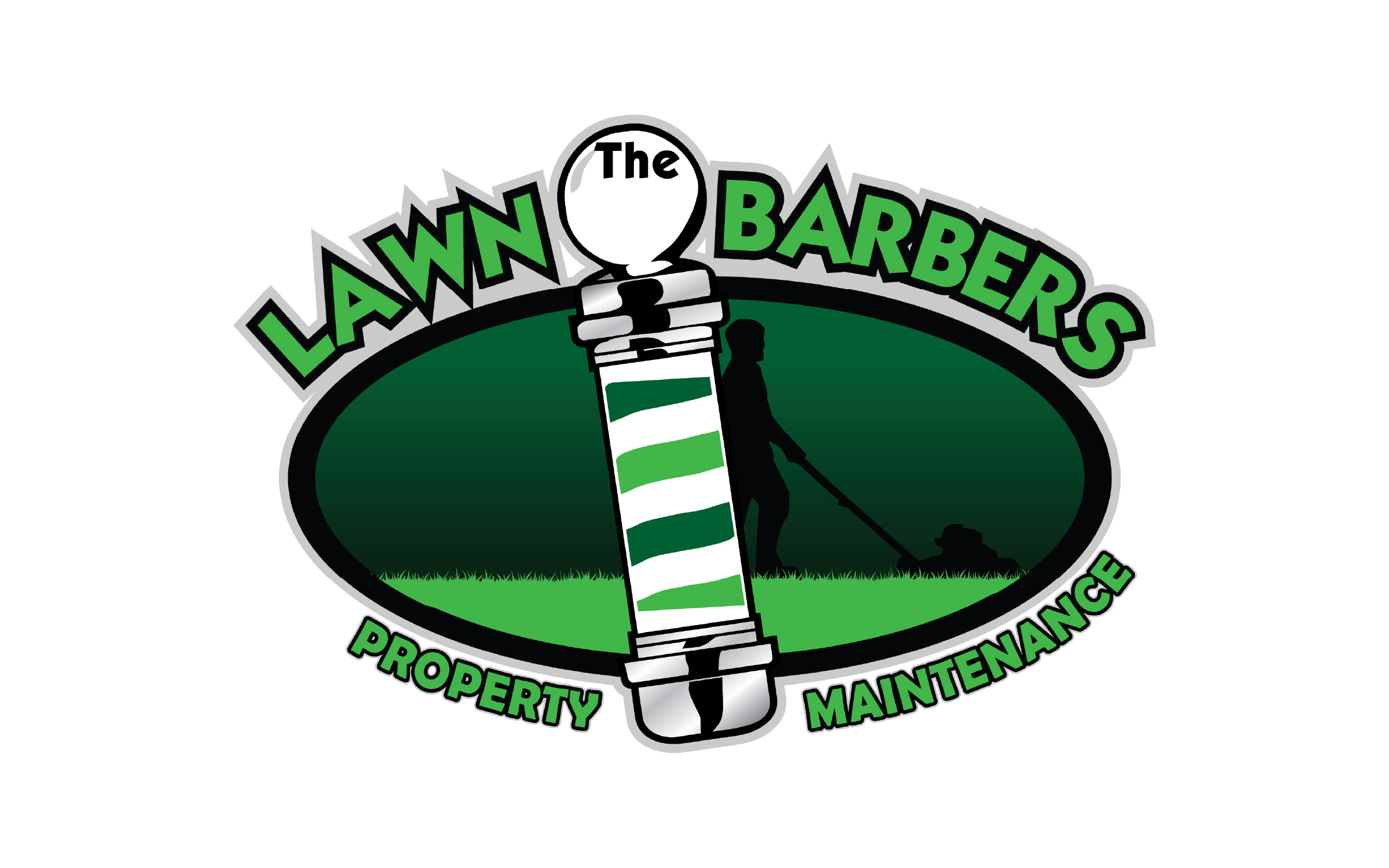
It also didn’t hold up where a trades business actually uses its logo. Gradients and chrome effects don’t translate to screen-printed shirts, embroidered hats or cut vinyl. The arched type and silhouette fall apart at small sizes. And there was only one version, so it got squeezed into every space whether it fit or not.
The goal: keep the barber pole, lose the clutter, and build something that works as well on a work shirt as it does on a trailer.
Sketches
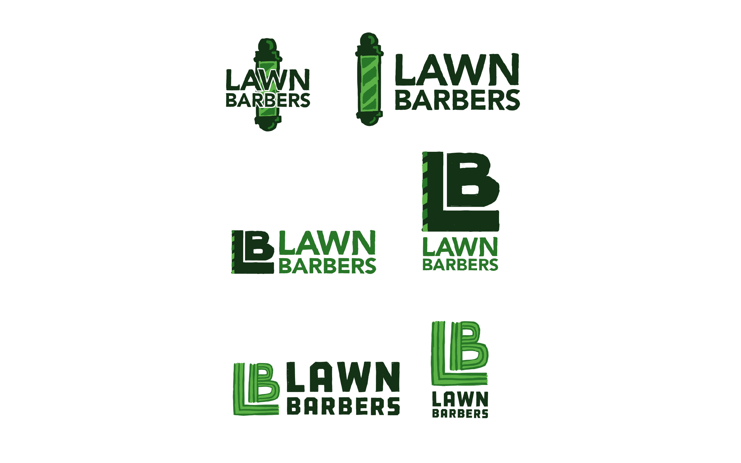
I started with quick sketches in three directions:
- The barber pole, simplified and paired with a clean wordmark
- An LB monogram, with the pole reduced to a striped edge
- An LB monogram built from mowing stripes, so the letters themselves say “lawn”
Narrowing down
All three went into rough vector concepts. The mowing-stripe idea came straight from a photo of a freshly cut lawn, which made it onto the board as a reference.
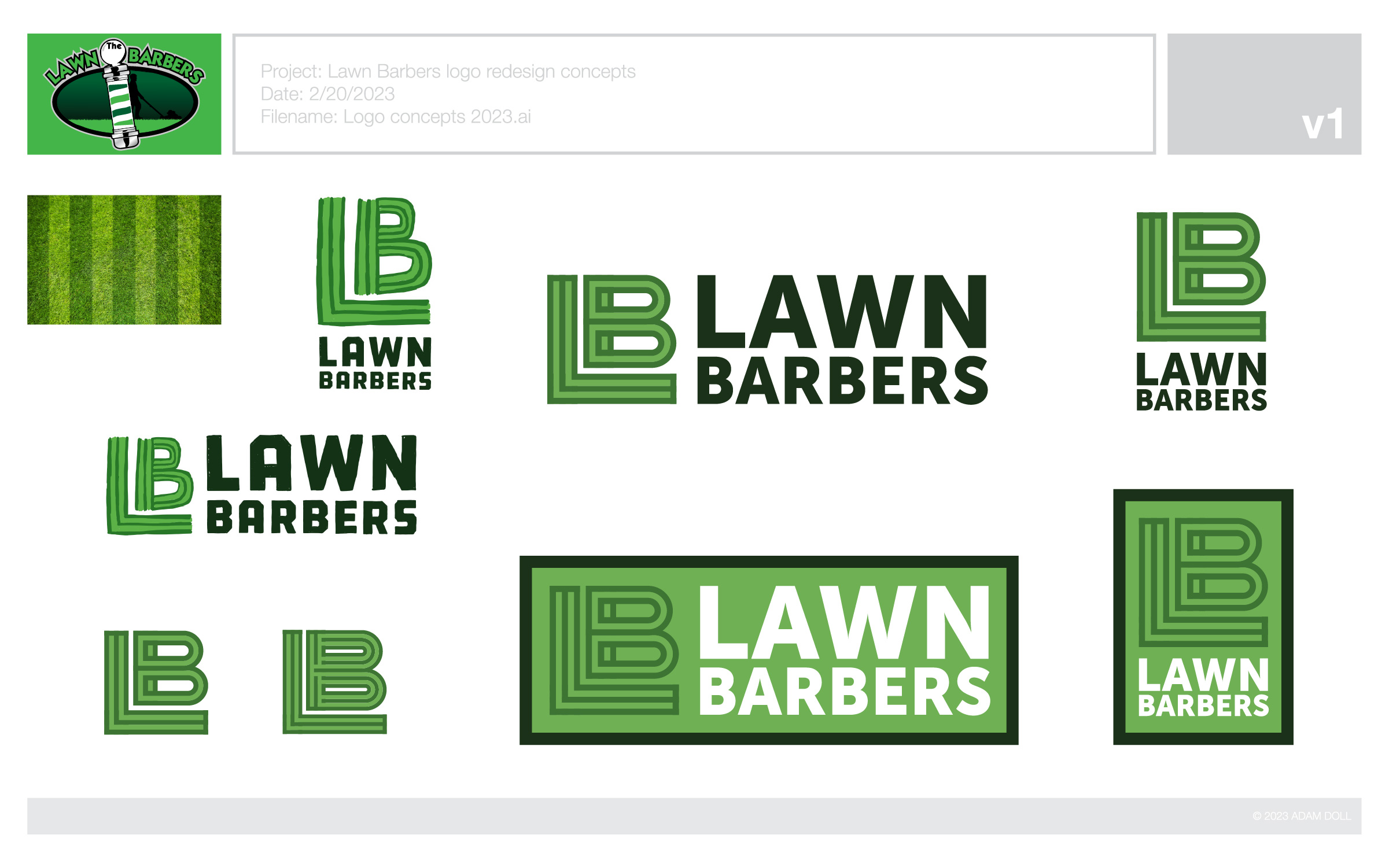
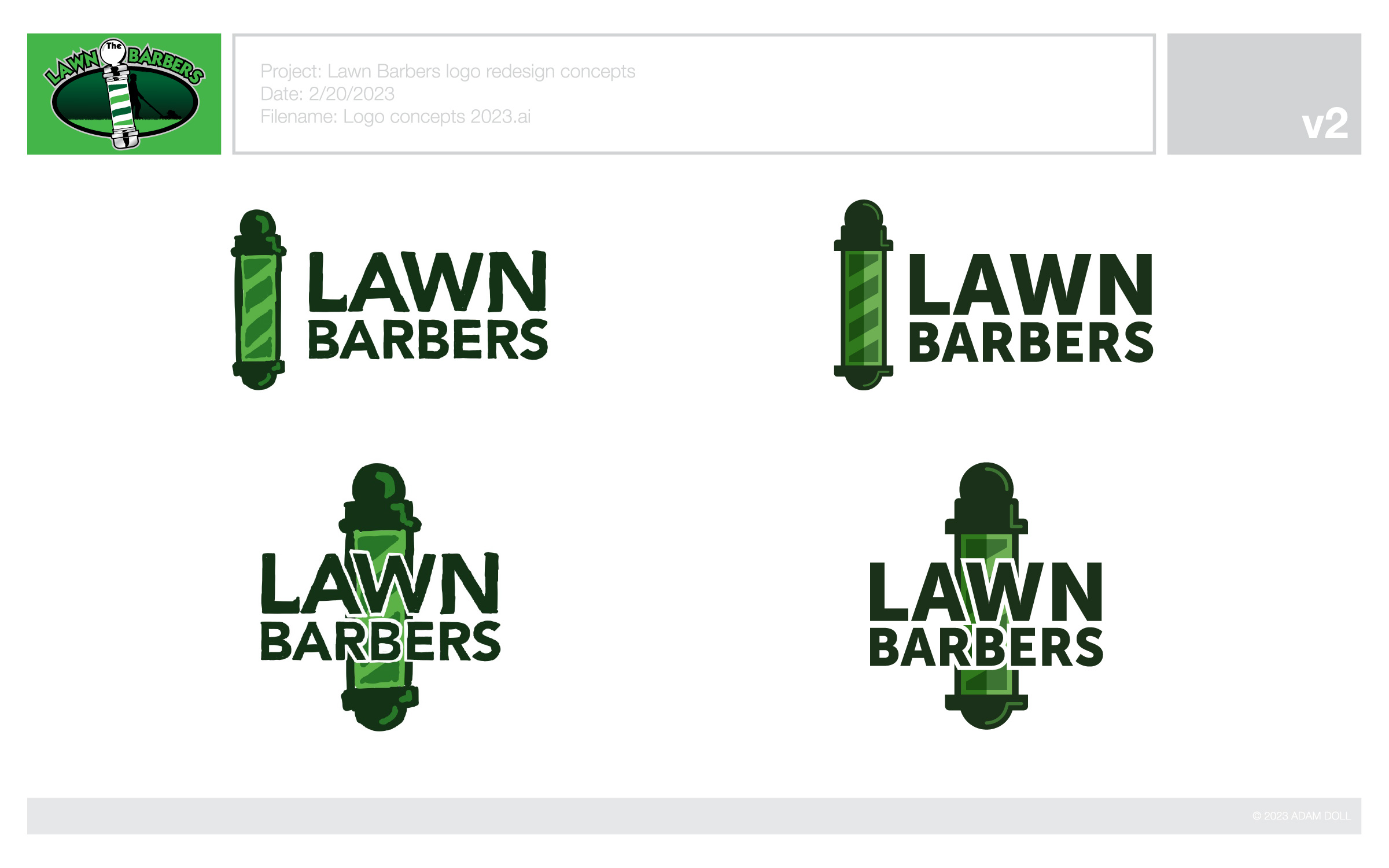
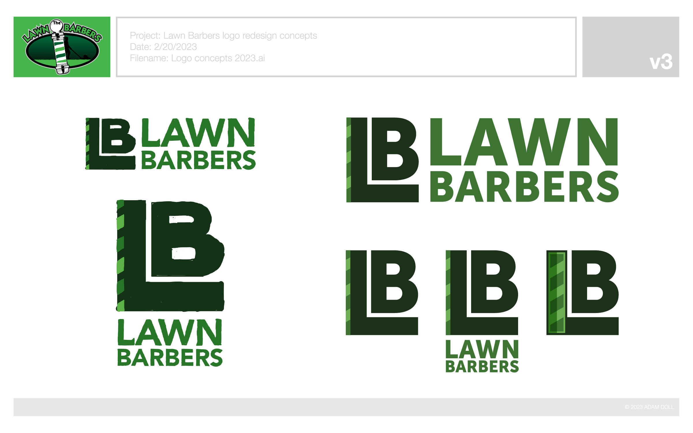
The client picked the barber pole, which kept the strongest link to the brand they’d already built. With the icon settled, I ran the lockup through several rounds of type to find a wordmark with the right weight and personality.
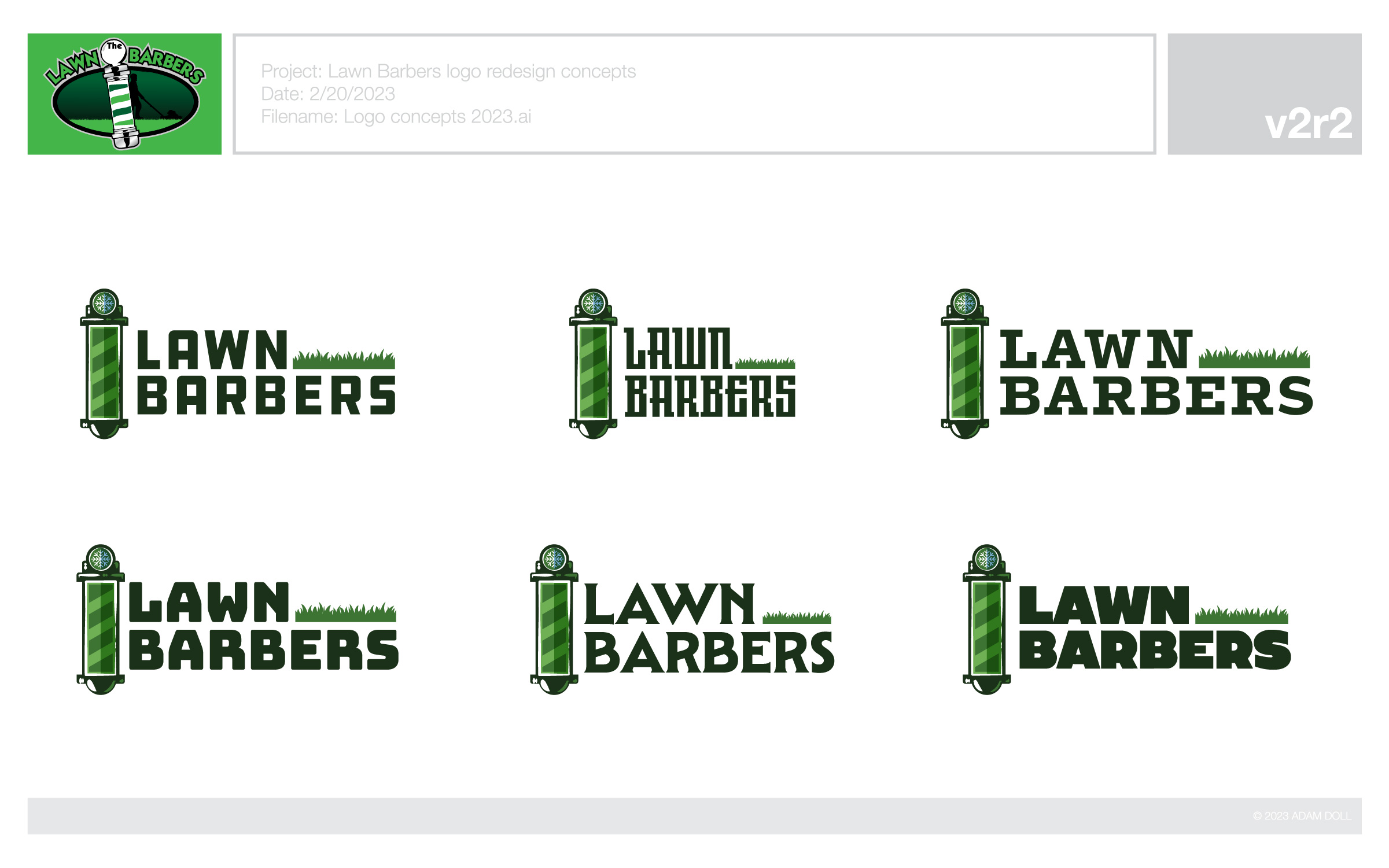
The final type is a squared, sturdy sans that feels at home on workwear and stays legible small. I also put a snowflake in the cap of the pole, so the mark covers their winter snow removal work without adding another element.
The system
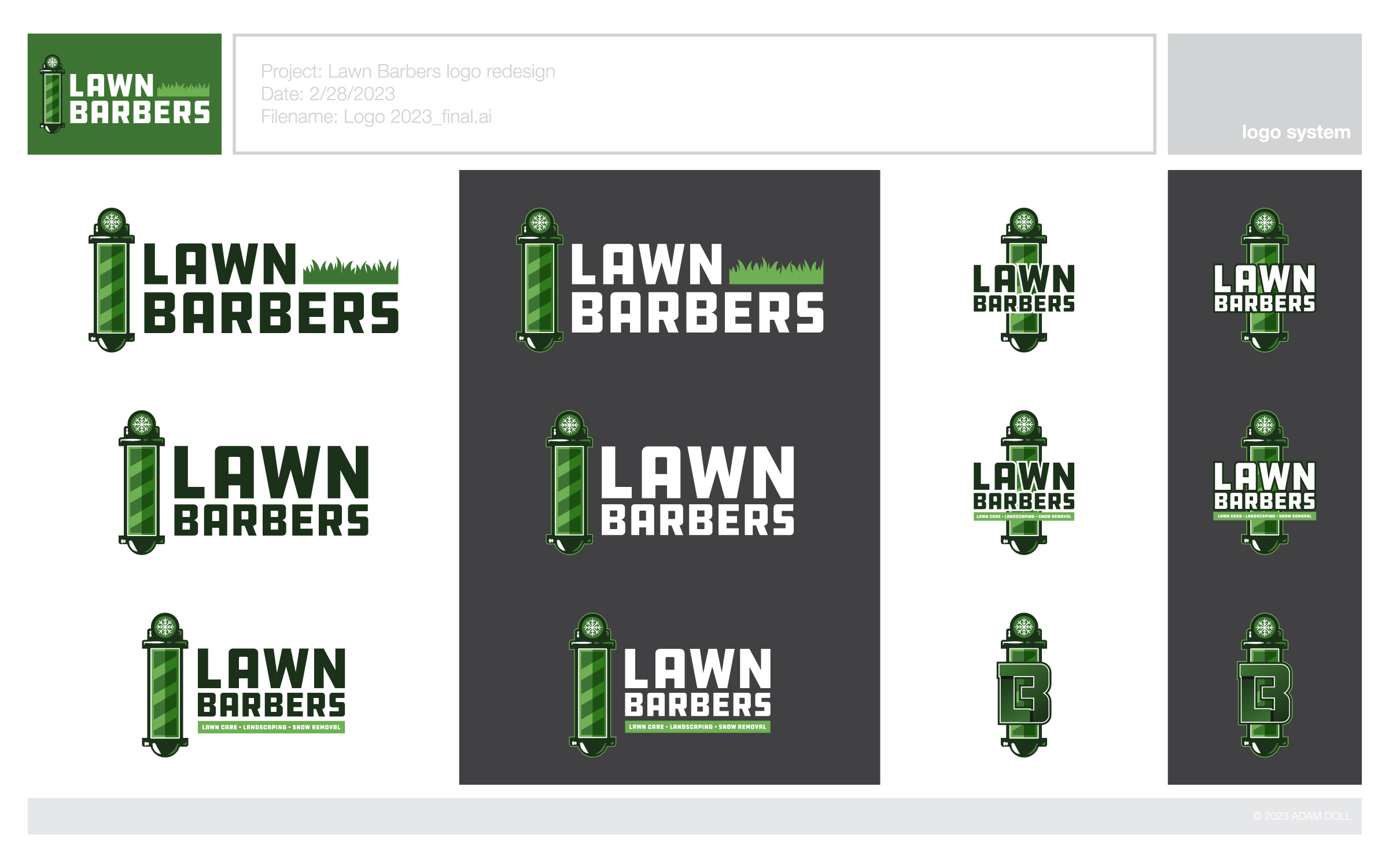
Instead of one logo, the final delivery was a system: a main lockup, an alternate without the grass, tagline versions, a vertical lockup for tight or square spaces, and an LB icon for anywhere the full name won’t fit. Every version works on light and dark backgrounds, in flat colour with no gradients, so it reproduces cleanly in any process.
- Pantone
- 7742 C
- HEX
- RGB
- 61 116 51
- CMYK
- 78 32 100 20
- Pantone
- 7489 C
- HEX
- RGB
- 111 176 84
- CMYK
- 62 9 90 0
- Pantone
- 5605 C
- HEX
- RGB
- 27 49 25
- CMYK
- 77 52 84 67
Concepts to final files took eight days.
Motion
The next step for the brand is motion: a short logo reveal, and a 6-second social spot versioned for 9:16, 1:1 and 16:9. Both are in progress and will land here soon.
In the wild
Once the system was done, I designed and built a new website to carry it: thelawnbarbers.ca. The dark-background lockup anchors the header, and the brand greens carry through the headings.
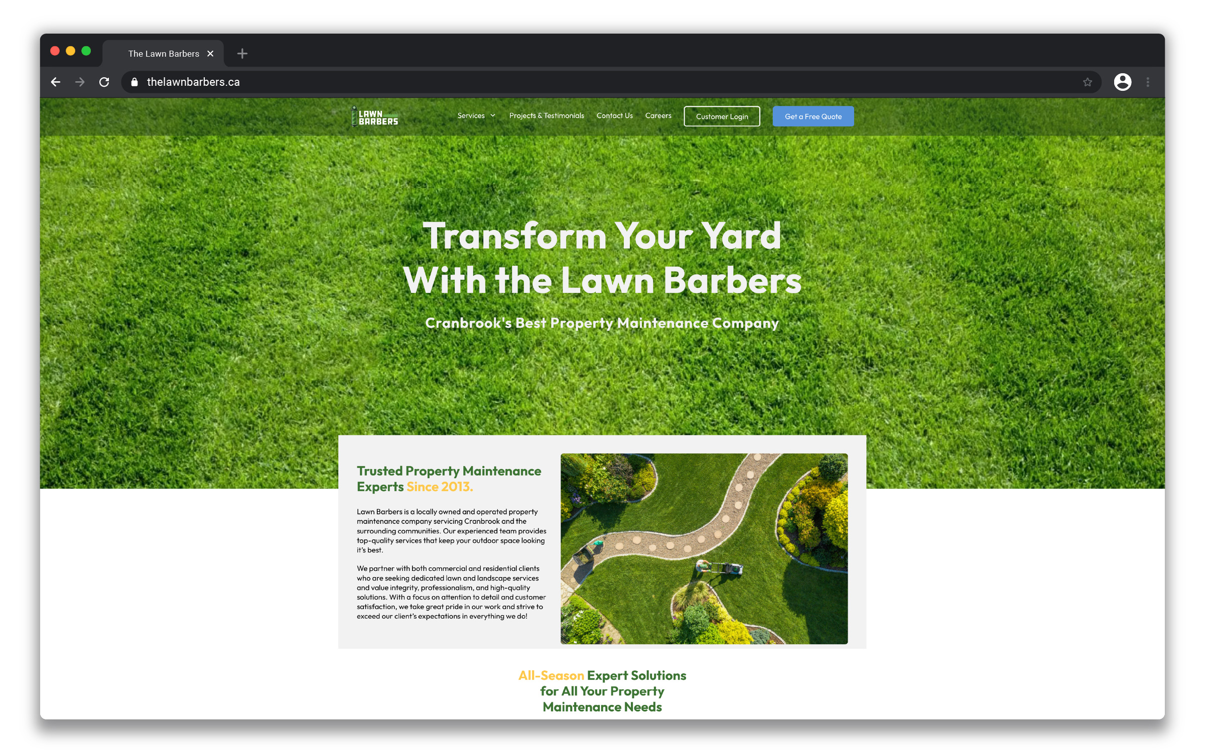
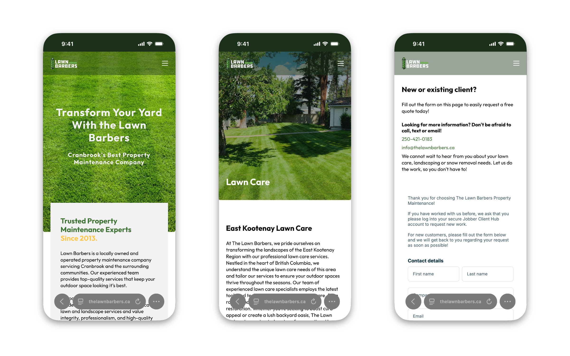
The site is built on WordPress with Bricks. Each of the six services has its own page, named for the area it serves, to help the business show up in local search. A “Get a Free Quote” button sits in the main nav on every page, and existing customers can log in to Jobber straight from the menu.
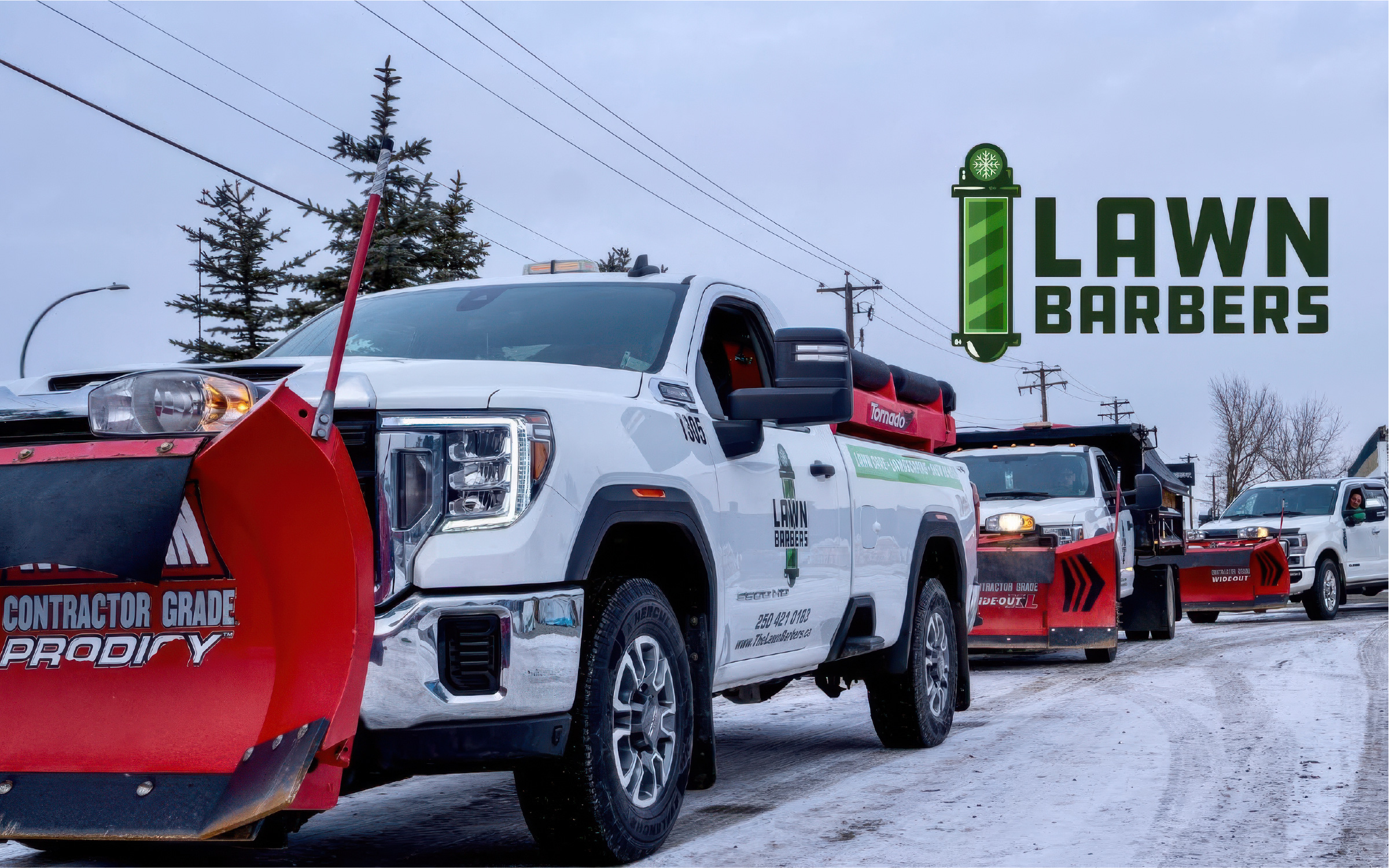
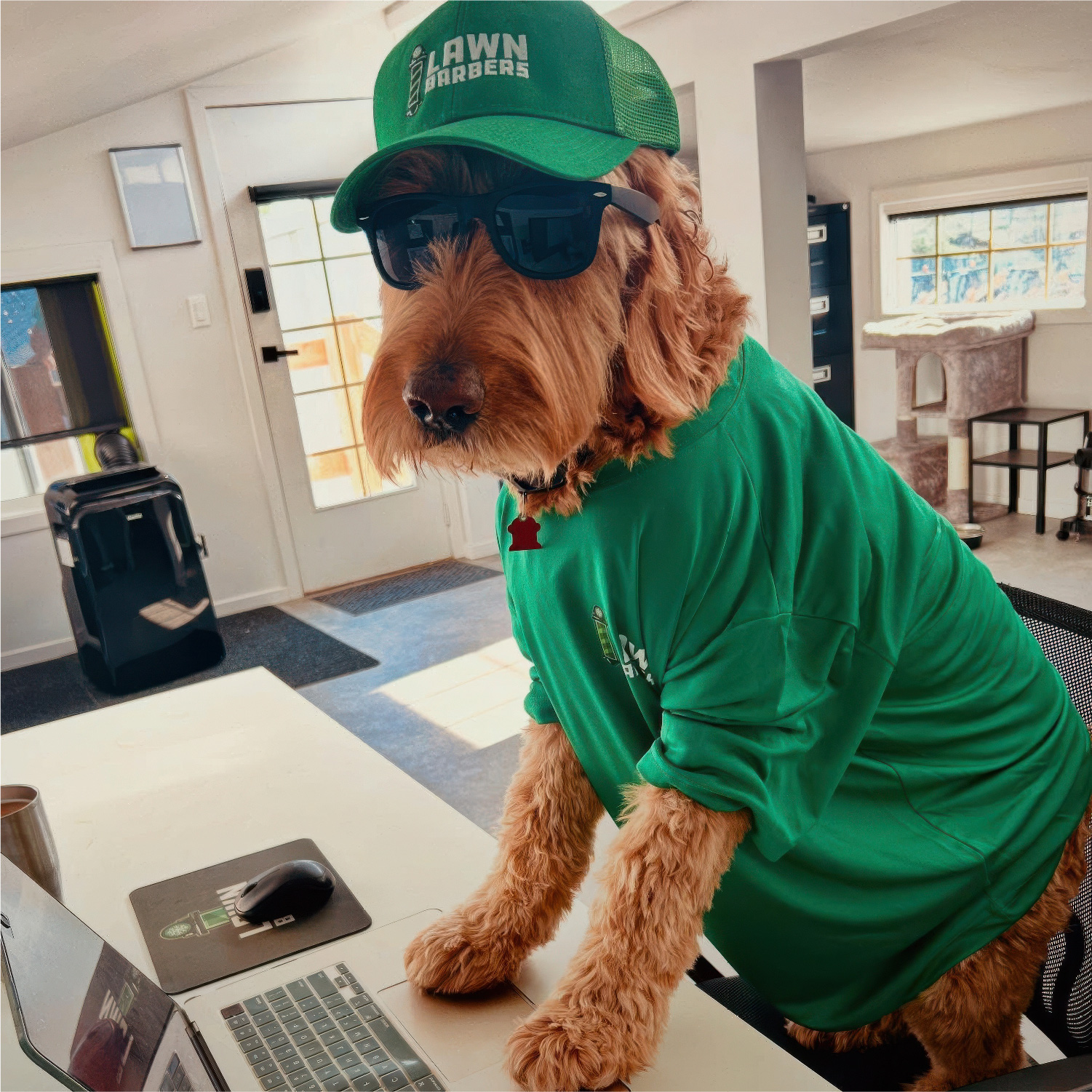
Because the system is built from flat colour with no gradients, it went straight onto the places a trades business actually lives: truck doors, hats, shirts and even the office mouse pad.
Reflection
Years in sign production have taught me that a logo only works if it survives the real world: cut vinyl, embroidery, a truck door seen from across a parking lot. Designing for the hardest application first is what made every other version of this system easy.
It also reminded me to bring the client real options rather than one answer. The barber pole wasn’t the cleverest idea on the table, but it was the right one for a business that had already built recognition around it.