Selkirk Signs · 2017
Selkirk Signs
Building and running the brand of a large-format sign company, from a logo system that works on real signs to the website, campaigns and systems that keep it consistent.
The brief
Selkirk Signs builds channel letters, pylon signs, vehicle wraps and storefronts for brands across Western Canada. A sign company’s own brand has to hold up to the same standard as the work it sells: it needs to look sharp on a truck door, a building, a business card and a phone screen.
The earlier Selkirk logos were short and very wide, which limited where they could go, and they relied on colours and effects that were hard to reproduce consistently.
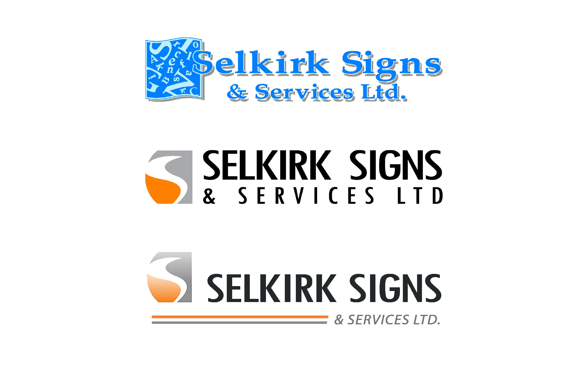
The 2017 refresh
In 2017 Selkirk approved a brand update. A colleague on the design team put together the new guidelines, and I pushed for the changes that would make the logo usable everywhere:
- A stacked lockup, so the logo fits vertical and square spaces instead of only wide ones
- Better balance between the shield and the lettering
- Solid colour, blackout and whiteout versions for vinyl, embroidery and anything that can’t print a gradient
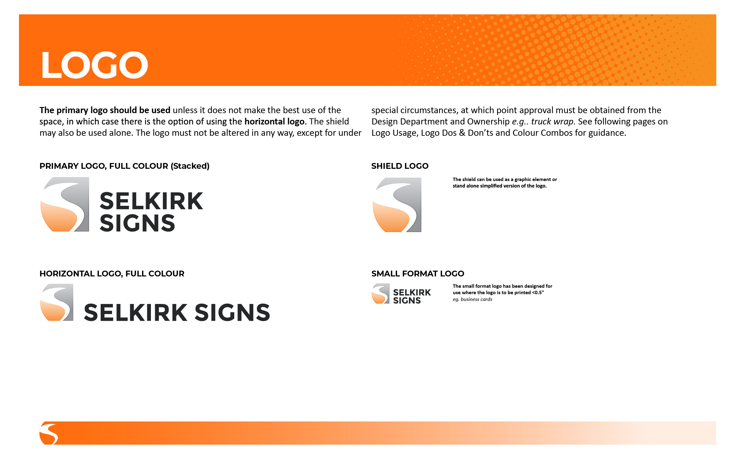
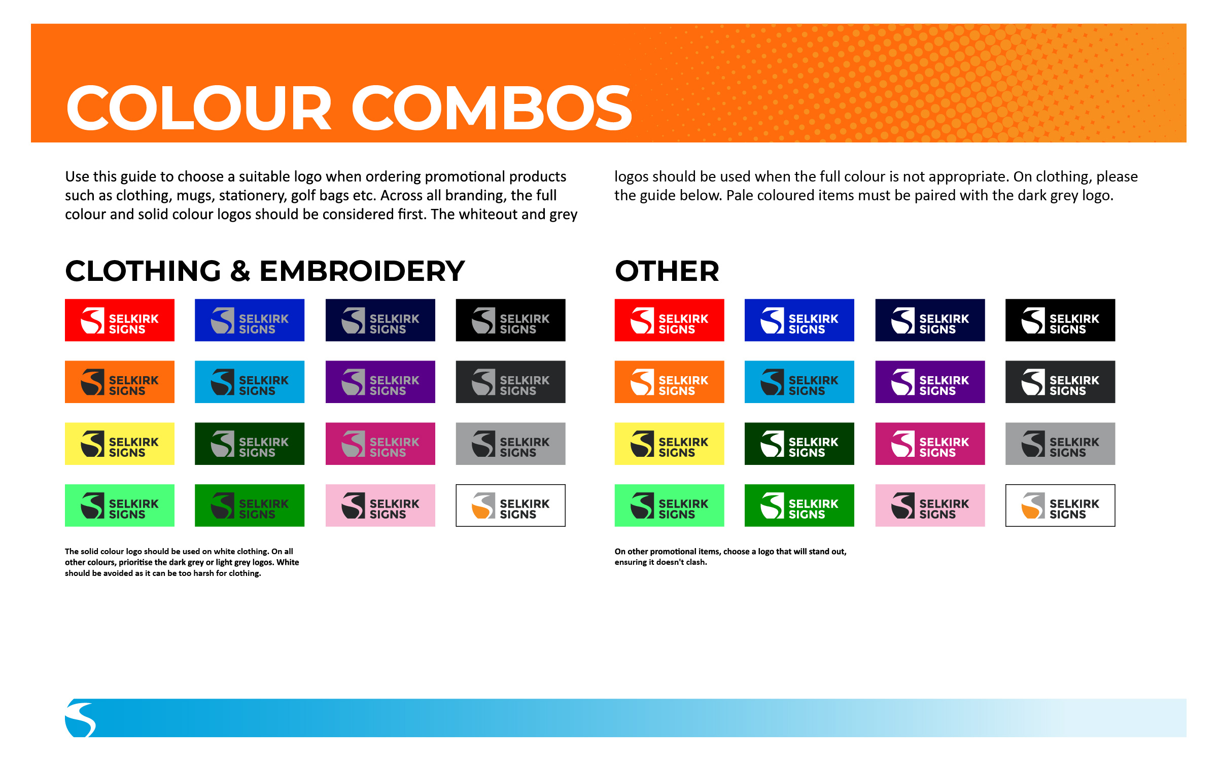
2017 brand guidelines, developed by the Selkirk design team.
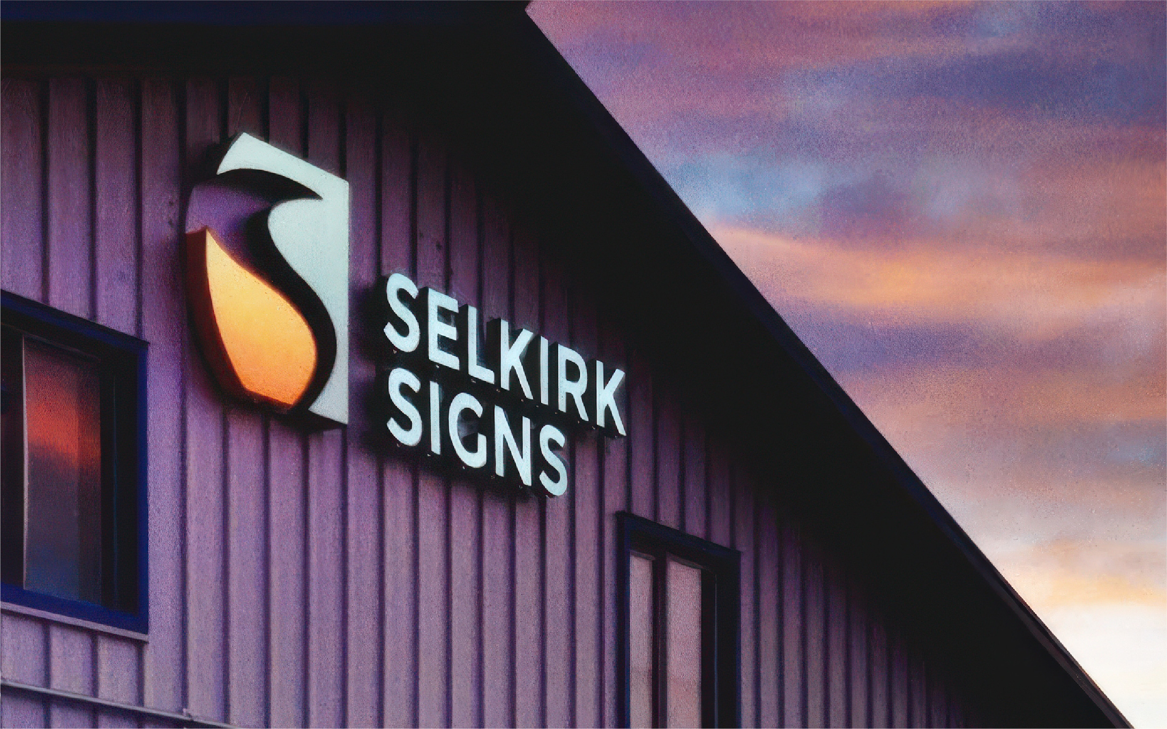
For a sign company, the real test is whether the logo can be built. The stacked lockup now hangs on the building as dimensional letters.
Bringing it to every touchpoint
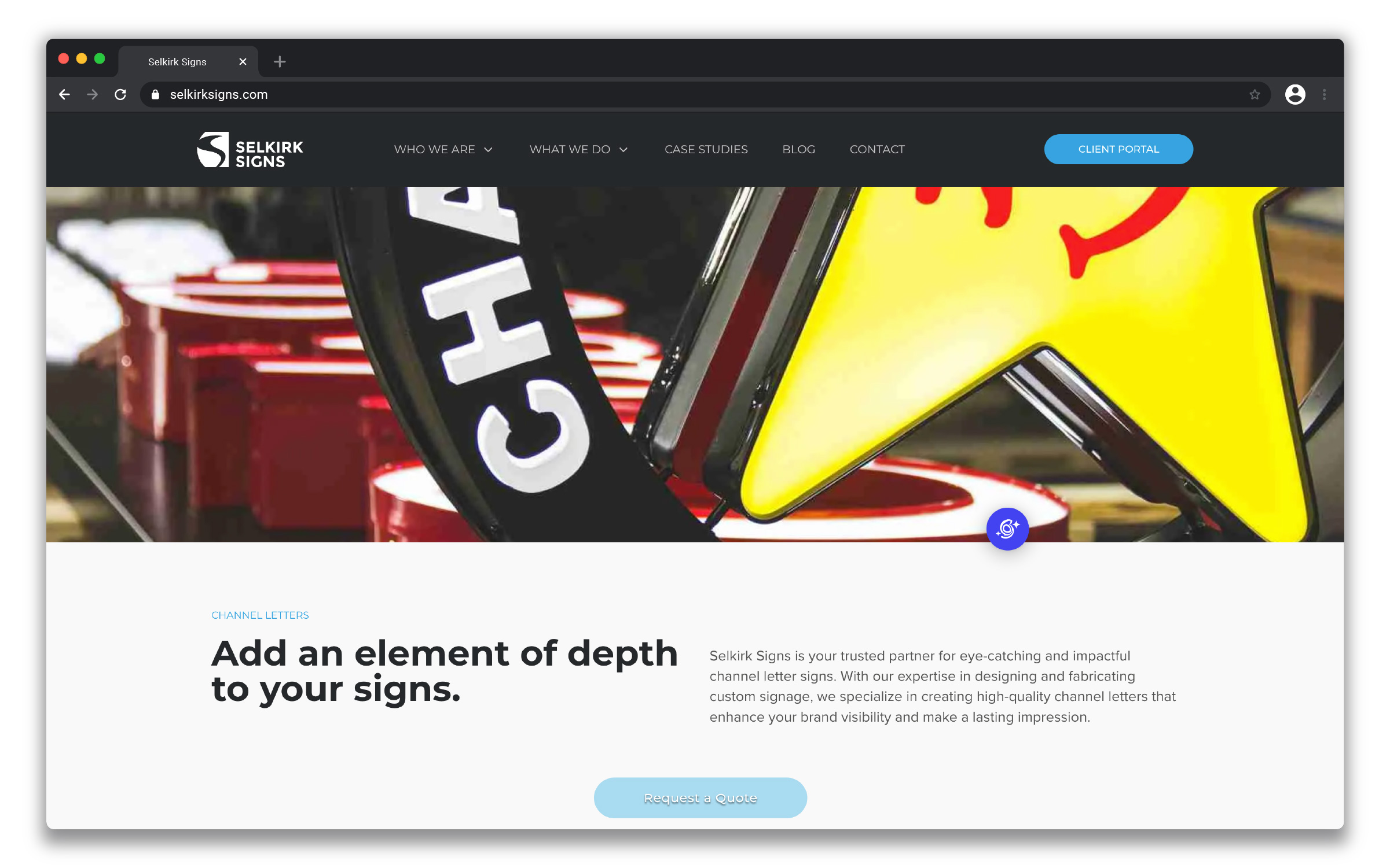
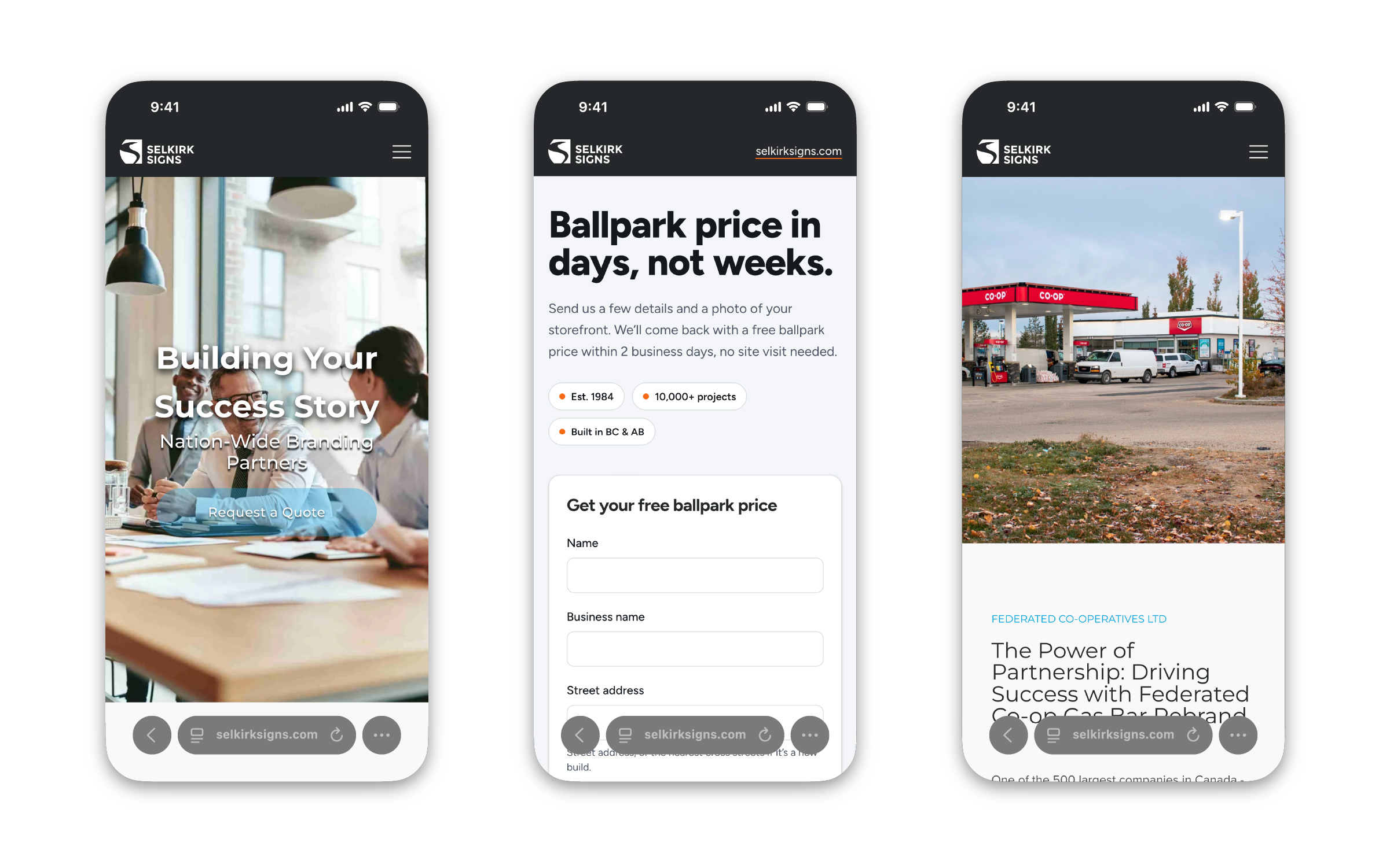
I look after every place the brand shows up: vehicle wraps, building signage, sales collateral, social media and paid campaigns. I also designed and built the company website.
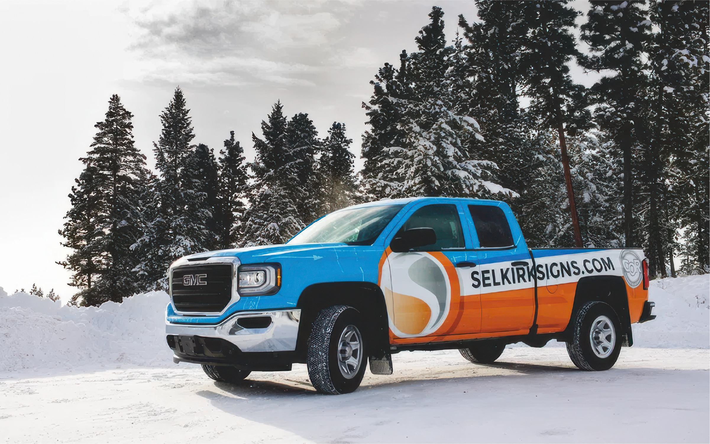
I designed the fleet wrap: a bold blue and orange layout that pulls the shield’s S into a large graphic on the doors and keeps the website big and readable from across the road.
Brand strategy and voice
Most sign companies sound the same: reliable, quality, on time. I position Selkirk as a whimsical guide: an expert who knows signs inside and out, and isn’t afraid to have fun when it fits. The content with a sense of humour has consistently performed best.
You can see that voice in the sign kudos series, where Russ heads out to highlight a great sign in the community. For every thumbnail I dress Russ in a costume that ties into the episode, like full Oilers gear for the Edmonton edition.
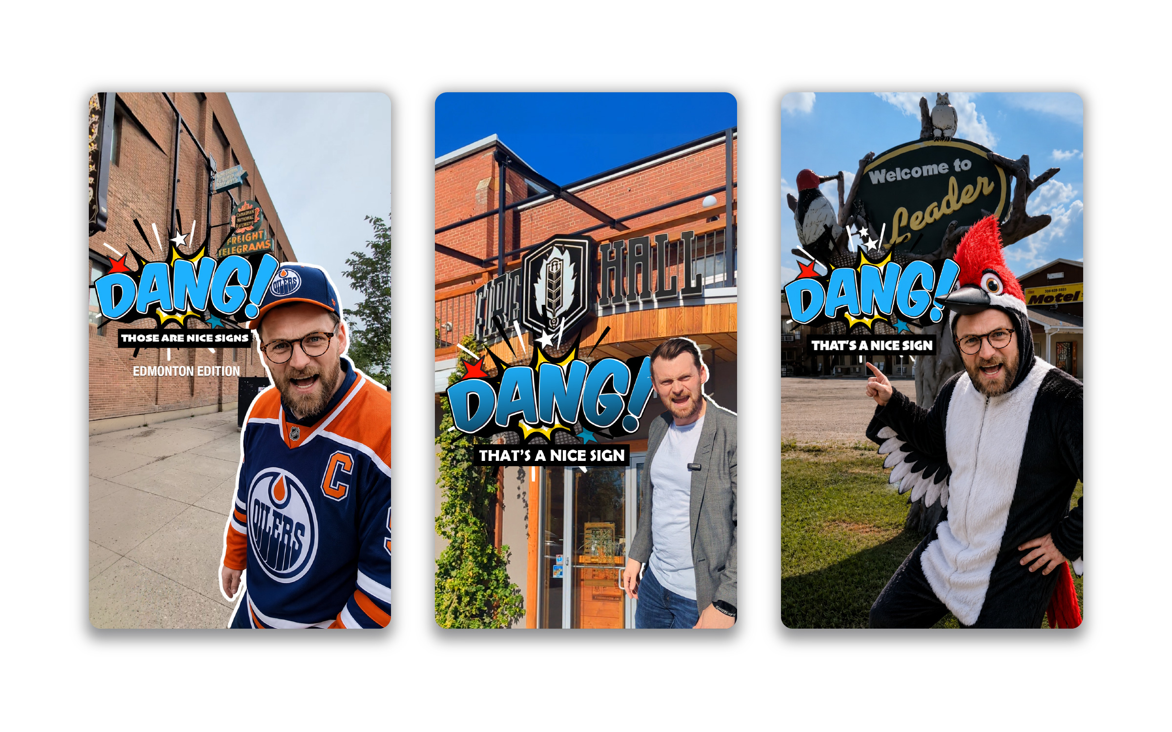
Every video signs off with the same short logo sting, so even the most playful content ends on-brand.
The humour lands. In one recent reel, Russ gives a high-energy intro to a tour of the manufacturing facility, then hands over to Brad, who points at each area and names it in a flat deadpan: “Paint. Channel letters. Office. Office. Office.” It reached 319 people and earned 32 interactions, about 10% of everyone who saw it, including 7 shares. Viewers stayed for an average of 31 seconds.
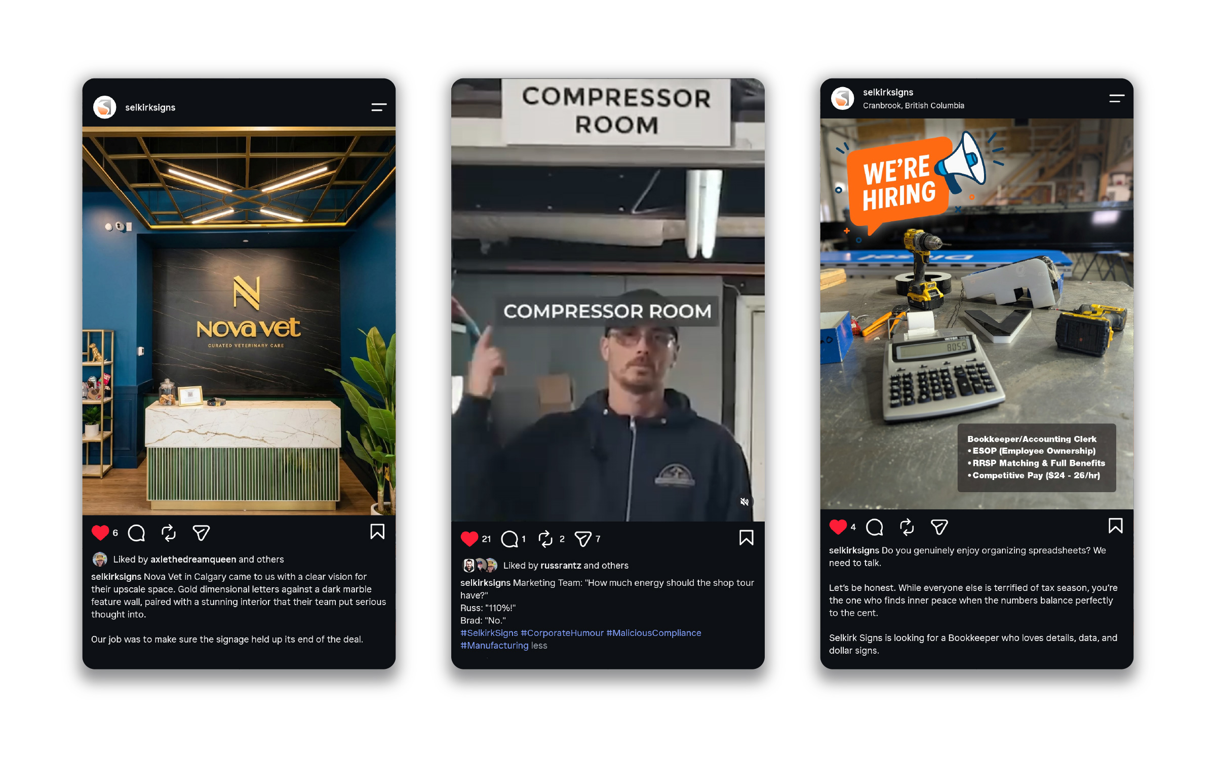
The same playfulness carries into merch. The design team creates fun secondary marks, like an “Est. 1984” badge, for giveaway stickers, t-shirts and events, so the brand has room to loosen up without drifting from its core.
Working inside other brands
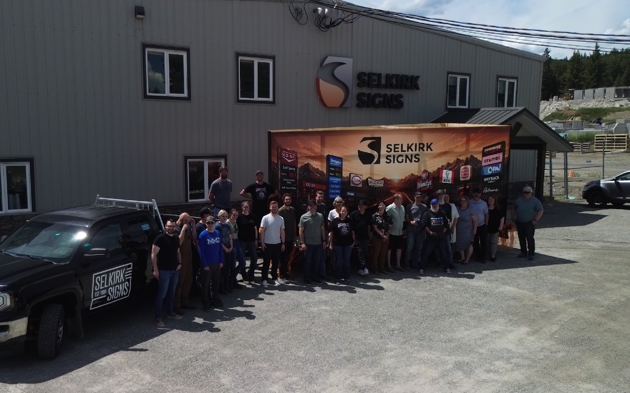
Most of what Selkirk produces carries someone else’s brand. I make sure the work for corporate clients, including Co-op, Tempo, Esso, Wendy’s, KFC, Burger King, Krispy Kreme and Crumbl, meets their brand standards. That means translating guidelines written for screens and print into signs built from metal, acrylic and vinyl.
I brought both sides together on the parade float, which I designed: the Selkirk logo front and centre, surrounded by the client brands it builds for, with the route linking the Cranbrook, Fort Saskatchewan and Calgary locations.
Campaigns
I plan, design and run Selkirk’s paid and organic marketing. One Meta campaign generated roughly $100,000 in estimate requests on $1,200 in ad spend. On organic social, we’ve beaten follower growth targets by up to 2.5× on a limited budget.
The creative is deliberately simple: a strong photo of finished work, with no graphics layered on top. The strategy lives in the pairing of photo and ad copy, so the sign does the selling and the copy gives people a reason to ask for a quote.
Systems that make a small team fast
A brand only stays consistent if the tools make consistency easy, and good systems let a small team do a lot.
- Client brand libraries. Cloud libraries of each key client’s approved assets and specs, so every job starts on-brand instead of being checked after the fact. A small design team can turn around a high volume of national-client work quickly and consistently.
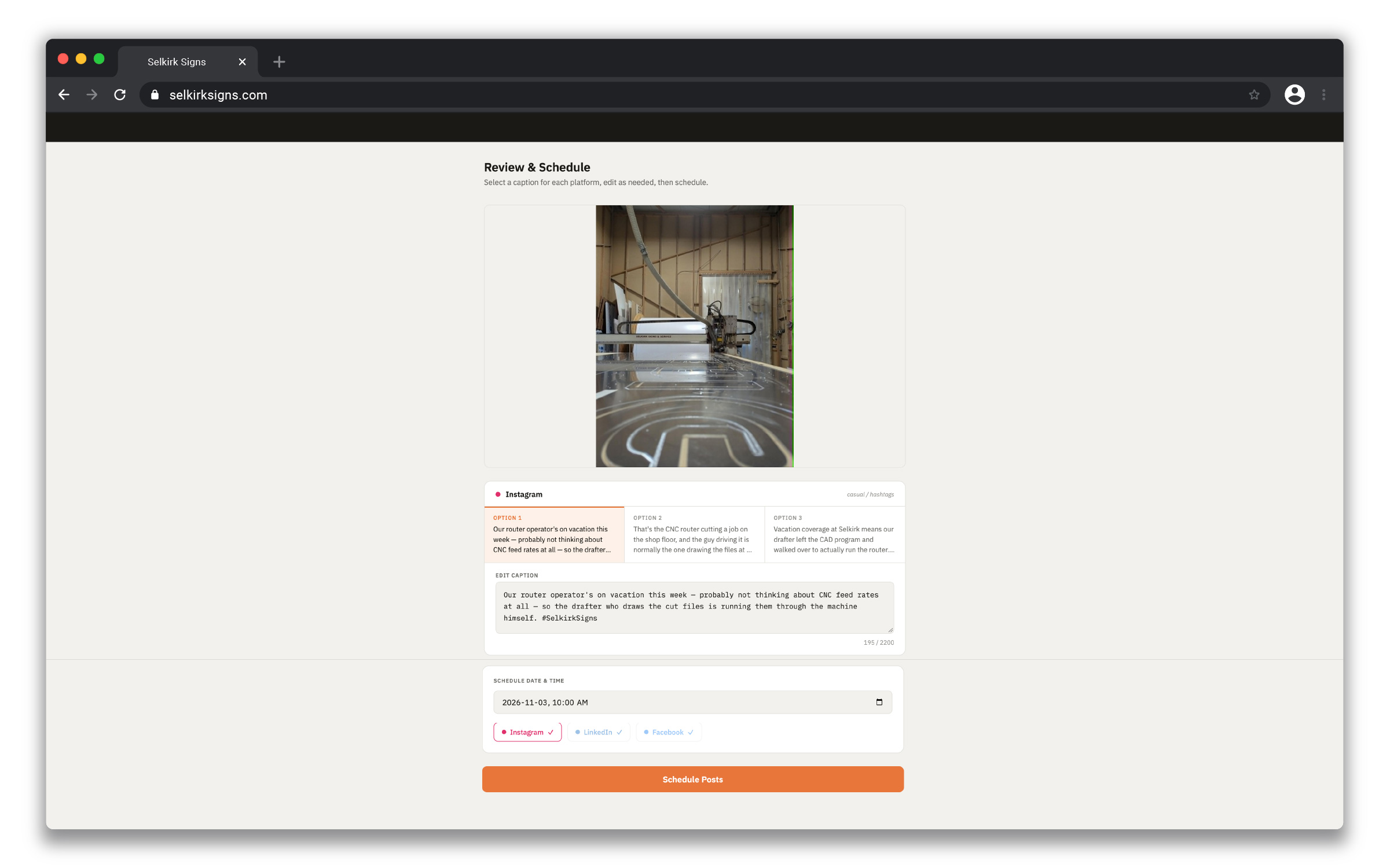
- Social Robot. An automation pipeline that takes job-site photos by email, drafts captions with AI, routes each post through a human approval page, then schedules it across Instagram, Facebook and LinkedIn.
- Client portals. A white-label system for branded project portals for corporate clients, now being rebuilt in Next.js.
Results
- A logo system that works on everything the company makes
- One consistent brand across vehicles, signage, web, social and paid media
- A small design team handling high-volume national-client work, faster and more consistently
- A Meta campaign returning ~$100,000 in estimates on $1,200 in spend
- Organic follower growth of up to 2.5× target
Reflection
Most brand work isn’t a big reveal. It’s thousands of small decisions, like which logo goes on which truck or which colour goes on which shirt, made consistently for years, and the systems that make those decisions easy. That’s the same approach I bring to every brand I work on.