Rockies Royale Slopitch Tournament · 2023
Rockies Royale
Two identities for a local slopitch tournament, built to be worn.
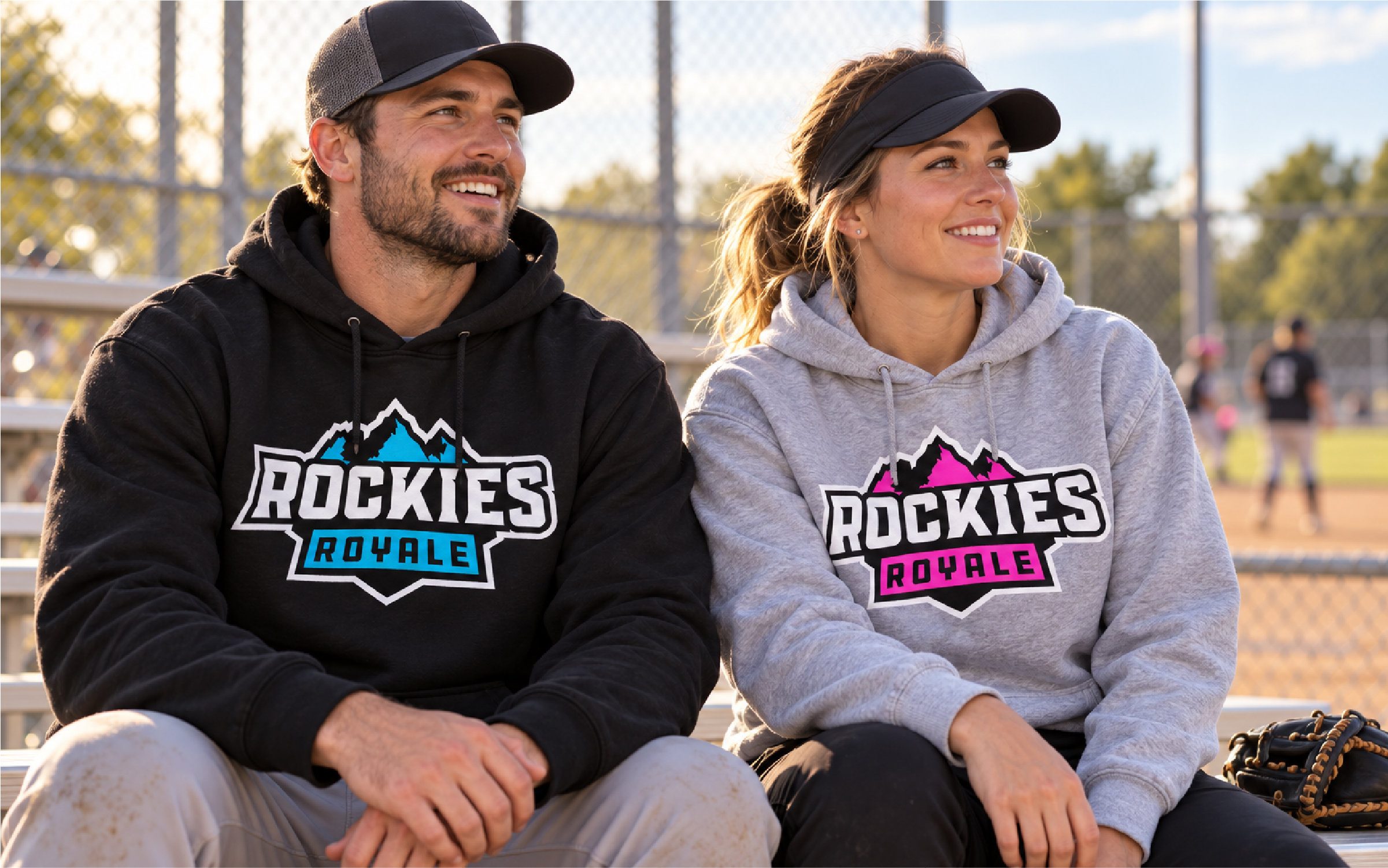
AI-generated mockup showing the electric blue and hot pink colourways.
The brief
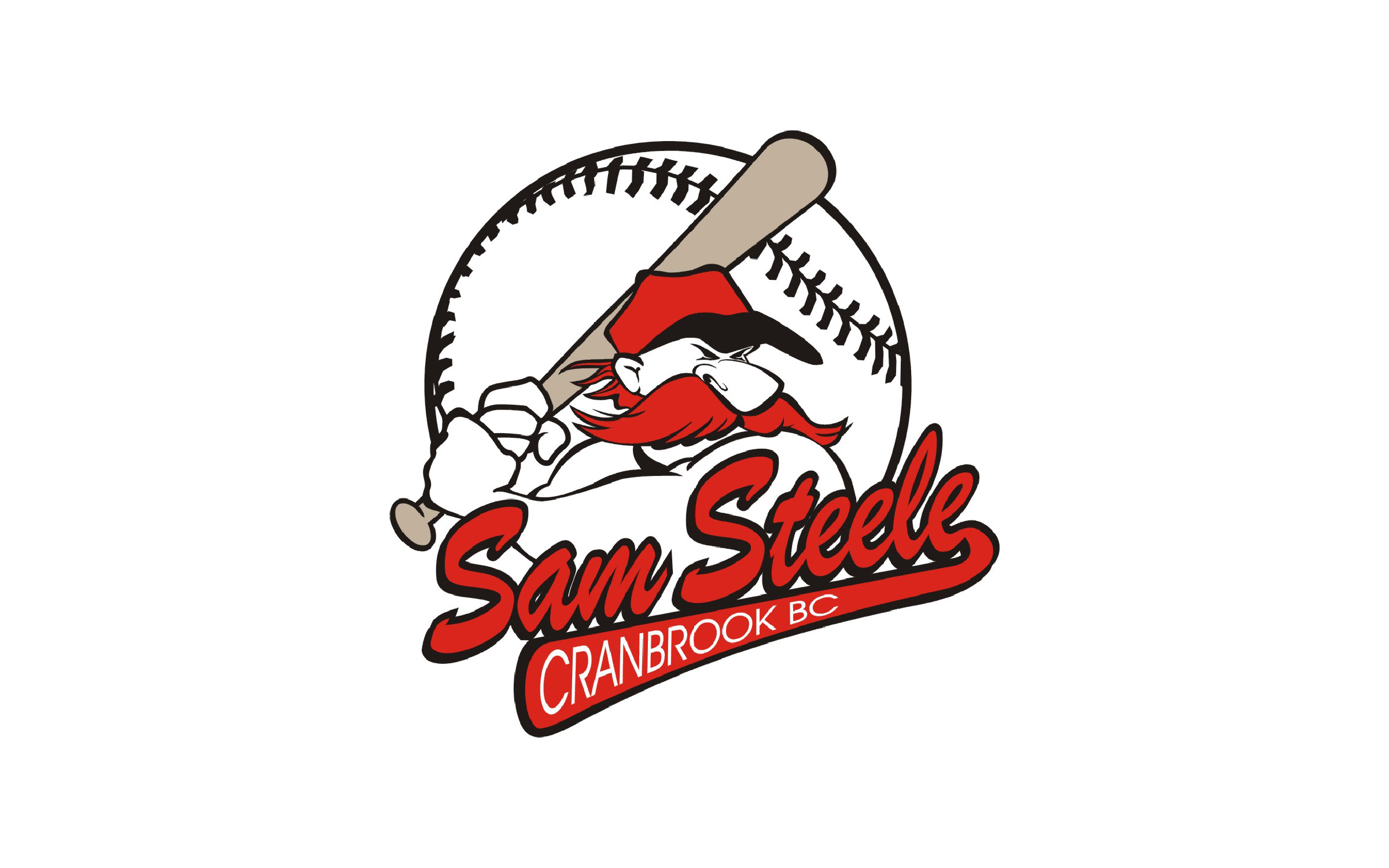
In 2012 I joined the executive board that took over the Sam Steele Slopitch tournament. It came with an illustrated mascot logo: a cartoon Sam Steele mid-swing over a baseball, with script lettering and a lot of fine linework. It had charm, but it looked dated, and it was hard to reproduce on anything except paper.
Hoodies are the thing people actually take home from a slopitch tournament, so the new logo had to work on one first.
Designing for the garment
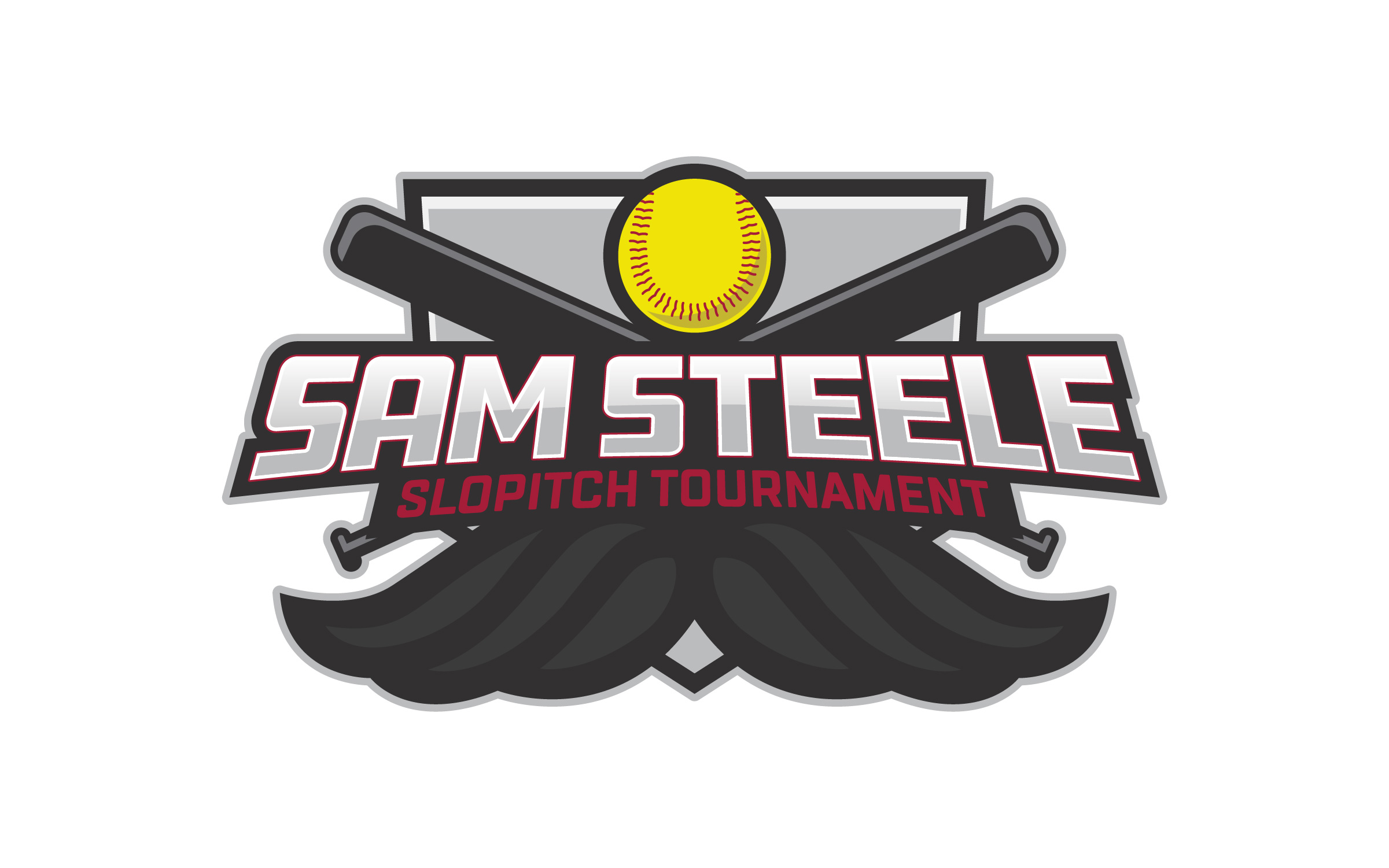
The new mark is a bold badge: crossed bats, a softball, chunky sports lettering that holds up at chest size, and an oversized mustache as a nod to Sam Steele himself.
Taking over the merch
For years, the merch was out of my hands. The board ordered a few dozen hoodies a year, and the sports store printing them handled the colour setup. That meant plain hoodies, like a red one with a single-colour black print that flattened the logo into a blob.
In 2022, most of that board stepped down. I planned to as well, but the new board asked me to stay, so I took on the merch myself. I set up the colourways, picked garments that made the logo look good, and ordered 105 hoodies. We sold out.
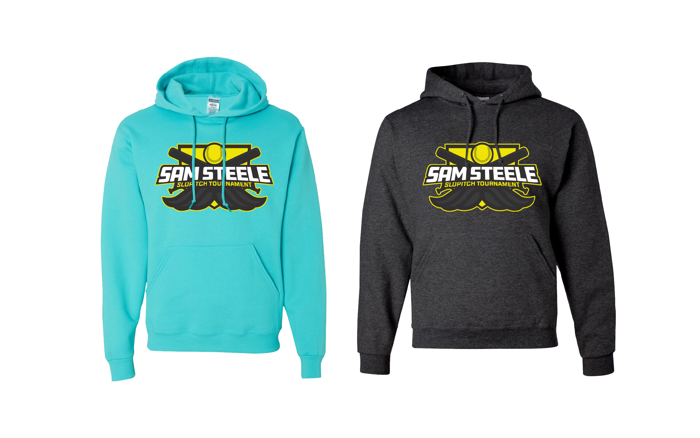
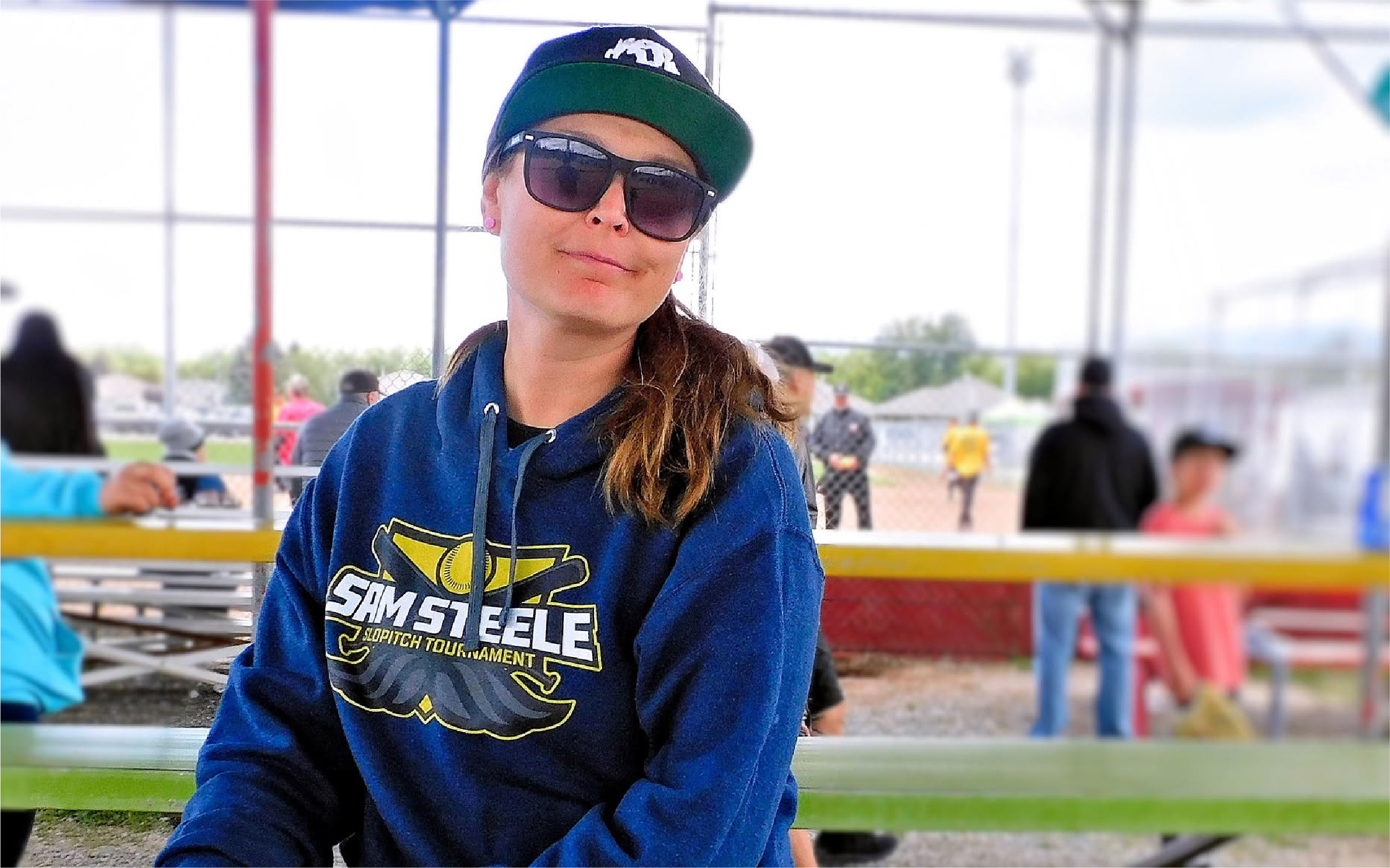
Photo: GB Photos
Every year I also made a one-off hoodie just for myself, in hot pink that first year. People got hyped about it, and it became a colourway the following year. That built anticipation for the next drop without spending a dollar on promotion.
The rebrand
In 2023, Sam Steele Days became the Spirit of the Rockies festival, and the tournament needed a new name to match, so I rebranded it as Rockies Royale. The rule stayed the same: design for the merch first.
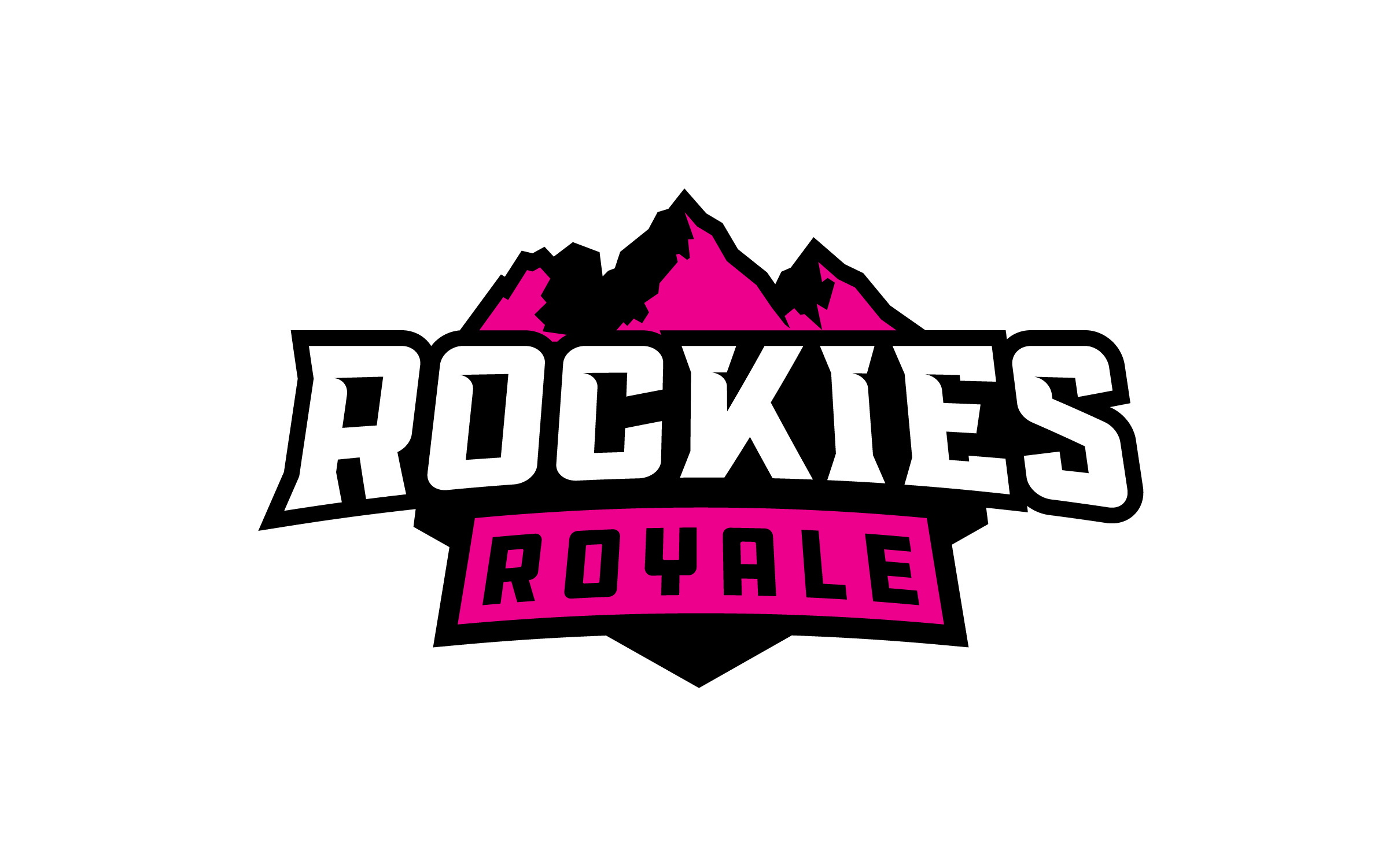
This time I designed with everything the Sam Steele merch had taught me. The logo is fully flat: black, white and a single accent colour. It’s simple to screen print, hard for a printer to get wrong, and the accent swaps to suit any garment. Hot pink and electric blue are the two main colourways.
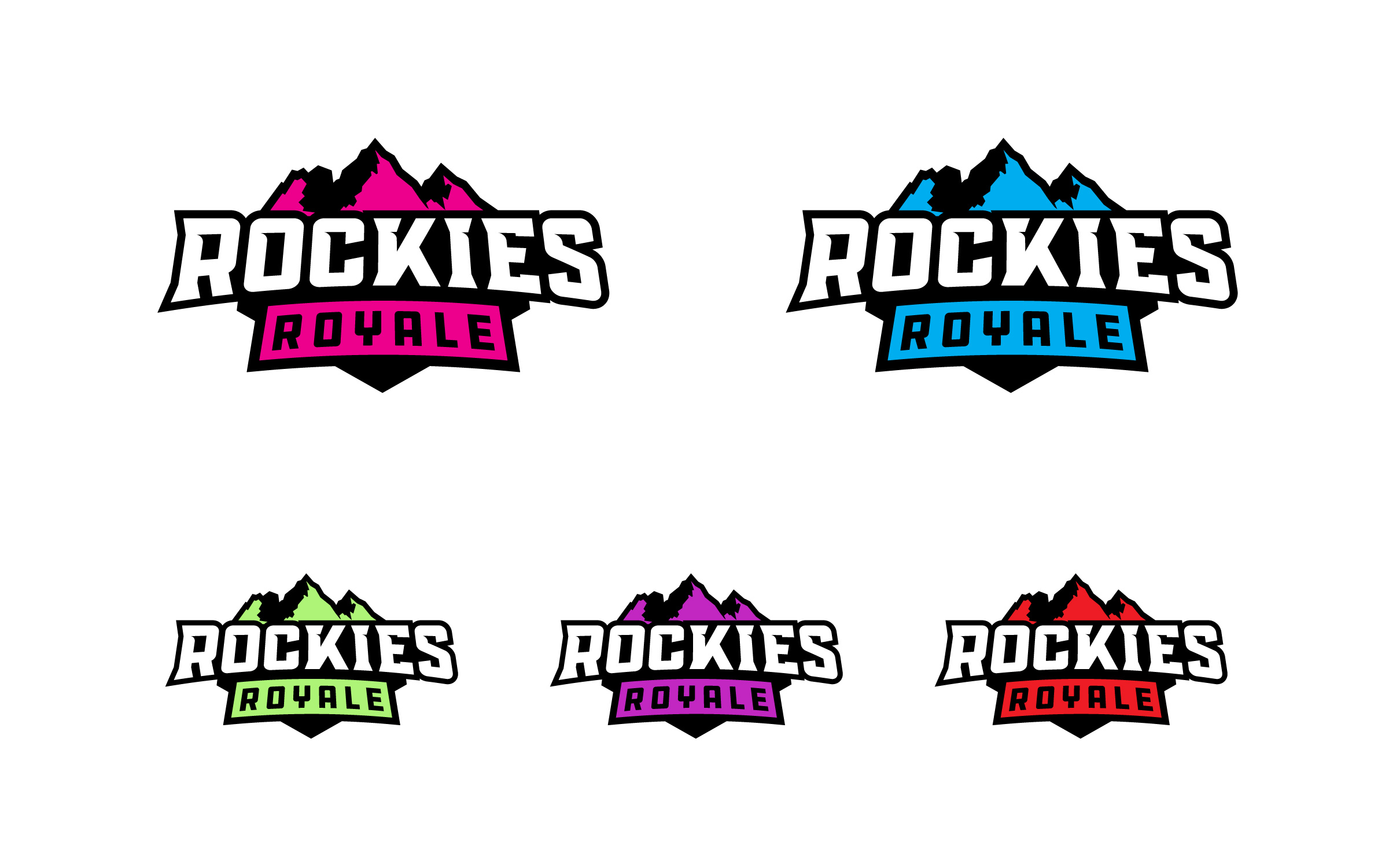
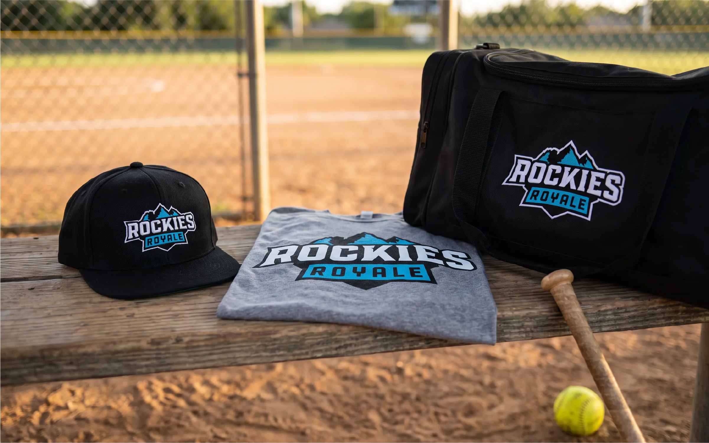
Mockup generated with FLORA.
The badge structure also works as a framework. For the tournament’s All-Star Game, I kept the mountains and the badge and swapped in new words, so the sub-event clearly belongs to the same family.
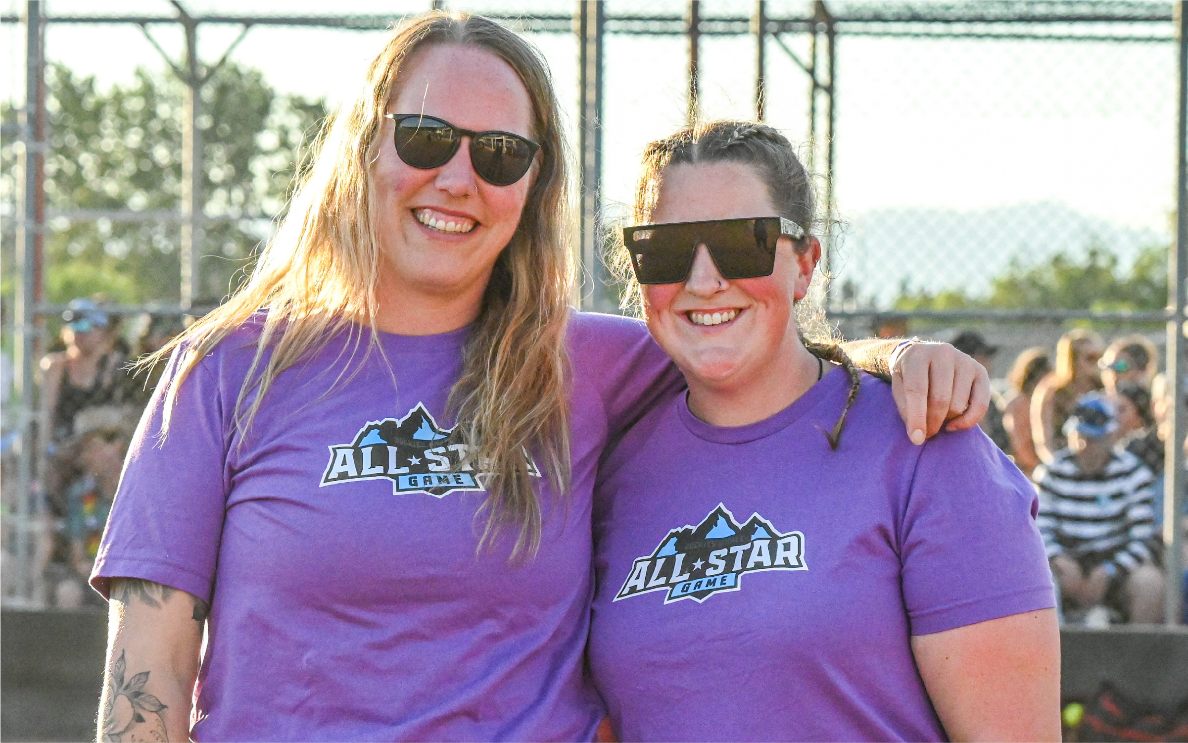
Photo: GB Photos
Results
- 2022: 105 Sam Steele hoodies, sold out
- 2023: 202 pieces in the first Rockies Royale run, with the remainder sold the following year
- 2025: 169 pieces
- 2026: 141 pieces
That’s more than 600 pieces across four seasons, for a local slopitch tournament.
Reflection
The biggest lesson here wasn’t in the logo. It was in the handoff. A good mark can still end up as a bad hoodie if someone else makes the production decisions. Once I owned the colour setup and the garment choices, the same logo started selling out.
Rockies Royale is that lesson built into the design. It’s fully flat and built around one swappable colour, so it’s easy to print well and hard to print badly.